An Introduction to Reports in AirPOS
Reports in AirPOS
Our very powerful reporting suite enables fast visibility across both online and in store sales giving you the ability to dig into your data like never before, discovering those vital statistics you need to really understand your sales patterns, best sellers, employee performance and more. Reports are accessed from the backoffice by selecting 'Reports' from the left margin or by using the mobile reports app for viewing your data.
- Reporting Dashboard
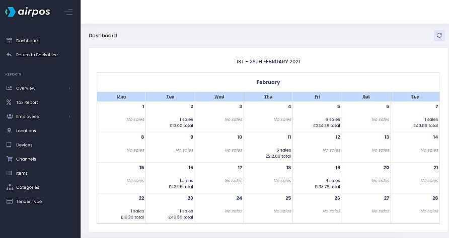
When you go to Reports you'll see a dashboard screen which will show a calendar view of the current month's sales similar to the Sales screen in the backoffice. There are a number of options available in the menu on the left.
- Reports Overview
At the top of the menu if you tap on 'Overview' you'll see an expanded list of options and a date range at the top left of the screen similar to the image below. This will show a graphical representation of your revenue for each day for the last thirty days. This is the default date range.
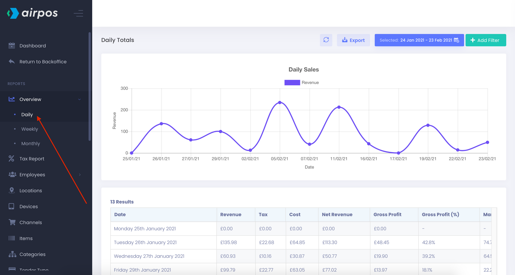
By tapping or clicking in the date range box two 'month' calendar boxes will appear in which you can select beginning and end dates for a date range and a number of preselected date ranges will appear on the left of the calendar boxes. You can use the arrows in the corner of the calendar boxes to navigate to earlier months or years. In this example the 1st of January has been selected for the start of the range and the 24th of February as the end.
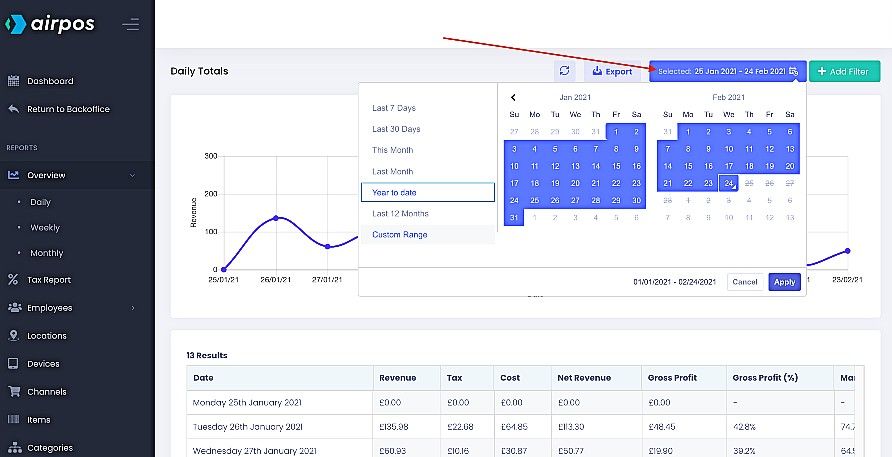
Below the graphical display of each report is a table of the data contained within the report. The daily sales report exposes each days trading figures; the total revenue for each day, the total tax paid, the total cost price of the items sold, the total gross margin and the profit margin expressed as a percentage. At the top of the screen is an 'Export' button which will export a .CSV file of the tabled data.
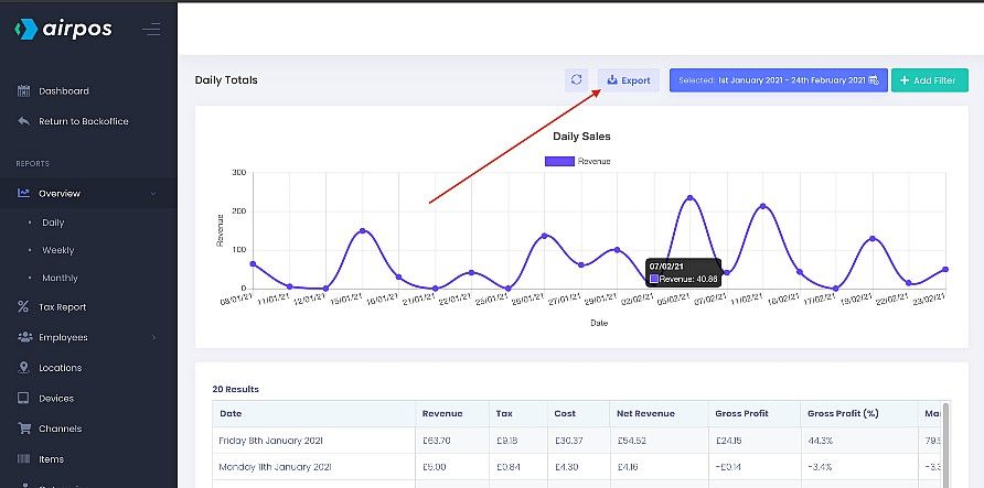
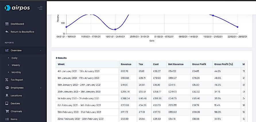
From here there are an array of reports you can run with the Advanced Reporting suite including daily, weekly and monthly sales. The data in each report can be easily exported as a .CSV file by pressing the green ‘Export’ button at the top of the screen. Below you can see the weekly sales report for the selected date range.
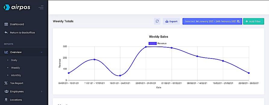
Below this graph is a table exposing the weekly sales data; the total revenue for each week, the total tax paid, the total cost price of the items sold for each week, the net revenue, gross profit and gross profit as a percentage.
The monthly sales graph for the selected date range looks like the following…
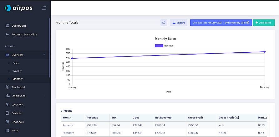
Below this graph is a table exposing the monthly sales data; the total revenue for each month in the selected date range, the total tax paid, the total cost price of the items sold for each month, the total gross margin and the profit margin expressed as a percentage.
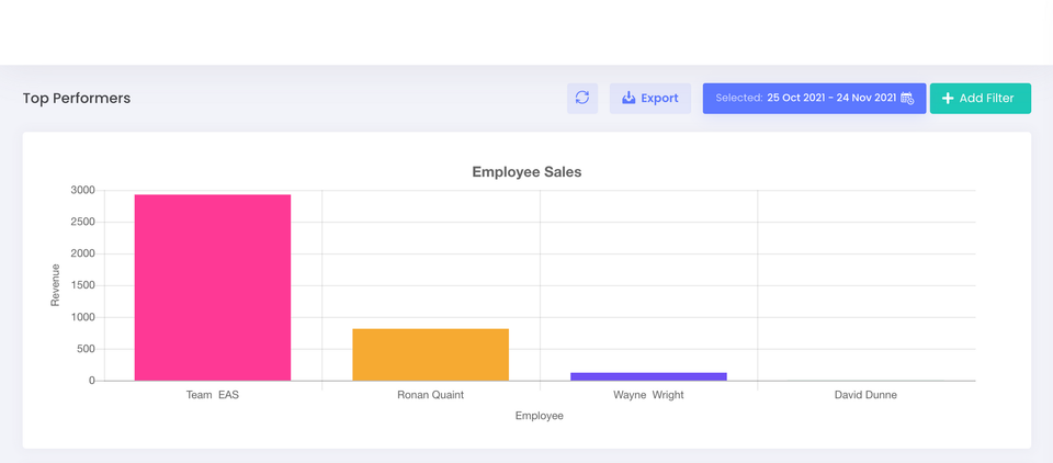
Below the overview in the left menu you can run separate reports for your Tax. You can look at the sales figures for each employee under 'Top Performers' and run an employee metrics report for each employee showing the number of sales, voids refunds, exchanges etc each had made.
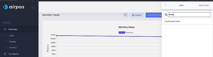
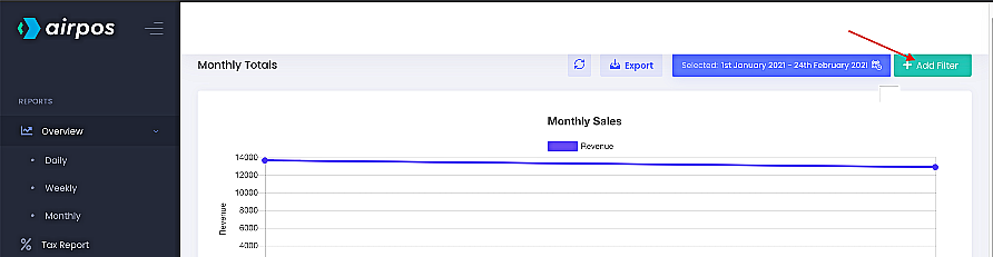
You can add a further filter by clicking on the ‘+ Add Filter’ button at the top of the screen.
You'll see a list of options for filtering from the available reports on the left such as an item, a category, device location or an employee.

If you want to look at sales for a specific item select 'Item' and start to type the name.